

This was a program-wide project involving a real life client, and we were asked to design a catalogue as well as a leave behind promotion piece that would suit the client's brand. In addition to the designs, we made paper prototypes to better showcase our ideas and I was honoured to be picked as one of four finalists to present our proposal to the client.


It was really exciting working with an actual client for the first time, and I spent a lot of time researching during the ideation process to make sure that what I created would align to the brand’s ideals and values, while also incorporating my own style and interests. It was a very fulfilling project, and I found the process of printing out my design and constructing it into something tangible quite fun.


DAENA is a scent marketing company based in Switzerland focusing on markets consisting of mostly European audiences. They offer services to companies that want to take a step further to elevate their brand and create a unique logo, but with smell instead of visuals. Their range of clients are wide, from luxury brands to hotels, spas, exhibitions, elderly homes and even special events like immersive experiences, there are many occasions that can greatly utilize an olfactory identity to take things to the next level.Other than olfactory branding, our client has an array of products and services available, including their scent diffusers, a curated selection of existing fragrances, custom scented products and also workshops for corporate events, seniors and individuals.
For display type, Kepler 3 VF was chosen as the serif typeface offers well balanced thick and thin strokes for higher legibility, but still keeping a feel of elegance and sophistication. For body text, Asterisk Sans Variable contrasts well as a sans serif typeface, boasting high readability and clean letterforms, making it easier for viewers to absorb information.
As for the colour palette, like scents, colour can also invoke emotions, and purple has always been a symbol of elegance and luxury, fitting with the image of Daena and elevating their services. The pink is used as a highlight, and is also a significant colour for flowers, which is an essential component of scent making. The green adds a sense of tranquility, which is also associated with forests and greenery such as pine and sandalwood; plants that are seen frequently in scents.
The colours are less saturated for a calmer, relaxed feel but there is still enough so that it doesn’t look dull. Overall, the colour palette should feel high end and timeless, but also incorporates a splash of personality with floral tones.


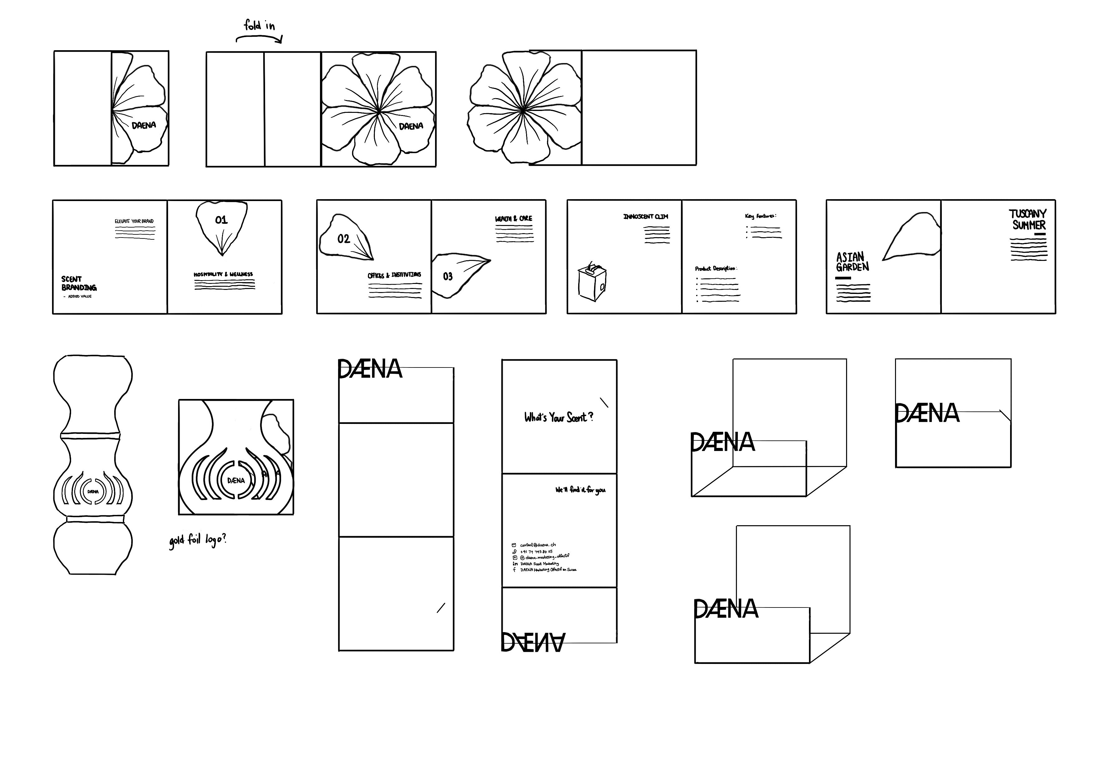
Throughout the catalogue, a concurrent graphic element that will be used are flower petals, signifying all the different components that are involved in the creation of a scent, but also in different sections of the catalogue they will slowly appear on each page, forming one full flower in the end, representing a flower blooming and the scents of DAENA spreading.
The sleeve is inspired by the shape and markings of DAENA’s Innoscent Pro diffuser, which is round but cut off at the base like a vase, with curve markings on the outer case.This adds an extra meaning to the sleeve, signifying the scent of flowers coming out from DAENA’s diffusers.On the left is a rough example of how the sleeve would look like, with the transparency of the vellum paper and a silver foil design.
The teaser promo card will be a variation of a gate fold, with a slit that allows the card to securely fold into itself.This allows for an interactive element, offering a higher chance of leaving an impression.It will be printed a heavier weighted paper so that card that can stand up on its own, allowing people to use it in photos and as decoration.


Flower Image by Freepik